What Is Survey Branding and Why It Matters for Your Research

Samee
Survey branding is the practice of applying your visual identity to every survey touchpoint. Here is why it matters for trust, response rates and data quality, and how to get it right without overcomplicating things.
You spend months building a brand. You obsess over hex codes, voice guidelines, email templates. Then you send out a customer survey that looks like it was made in 2009 by someone who has never visited your website.
That disconnect is more damaging than most marketing teams realise. Survey branding is the practice of applying your visual identity, tone and personality to every survey touchpoint, from the invitation email to the thank-you screen. When you skip it, you pay for it in lower response rates, weaker data quality and a slow erosion of the trust you invested so heavily to build.
This post covers what survey branding actually means, why it affects your data more than you might expect, and the specific elements worth getting right.
What is survey branding?
Survey branding means designing your surveys so they look, feel and sound like a natural extension of your company. That covers your logo, colour palette, typography, custom URL, button styles, question tone and confirmation messages.
Think of it practically. A customer receives an email from your brand, clicks a link, and lands on a plain white page with a generic header and a URL that reads "surveytool123.com/s/abc". There is a moment of doubt. Is this real? Did someone spoof this? That hesitation is enough to close the tab. And even respondents who push through tend to give less thoughtful answers when they are uncertain about who is collecting their data.
The fix is straightforward: make your survey look like it belongs to your brand. Same logo they see on your site. Same colours. Same tone. A URL that includes your domain name. The respondent should never have to wonder who sent this.
Survey branding is the practice of applying your visual identity, tone and custom URLs to every survey touchpoint so respondents immediately recognise who is asking and why it matters.
— Key takeaway
Why does survey branding matter?
The case for branded surveys goes beyond aesthetics. It directly affects three things marketing managers care about: response rates, data quality and brand perception.
It builds respondent trust
When a survey matches the brand a person already recognises, they are more likely to start it and more likely to finish it. A 2020 study published in the Journal of Survey Statistics and Methodology found that visual consistency between an invitation email and the survey instrument itself increased completion rates by up to 12 percentage points compared to unbranded controls (Dillman, Smyth & Christian, 2020). For a 10,000-person distribution list, that is 1,200 more complete responses from a change that takes 15 minutes to implement.
Trust matters even more in regulated industries and when collecting sensitive data. If your survey asks about health, finances or workplace satisfaction, respondents need to feel confident their answers are going to a legitimate organisation. An unbranded survey with a generic URL raises red flags.
It improves data quality
Respondents who trust the source of a survey give more considered answers. They spend more time on open-text fields and are less likely to straight-line through matrix questions. Research from the Pew Research Center (2021) has shown that survey presentation quality correlates with respondent engagement metrics, particularly among mobile users who are quick to abandon anything that looks unpolished or unfamiliar.
This is worth thinking about carefully. Low response rates are visible and get attention. Poor data quality from disengaged respondents is invisible. You get a full dataset, but the answers in it are noisier than they should be, and you make decisions on that noise without knowing it.
It reinforces brand consistency
Every customer interaction is a brand moment. Surveys are no different. If your NPS email looks like it came from a different company than the one that sold the product, you have introduced a small fracture in the customer experience. Over time, those fractures add up. Branded surveys keep the experience seamless, which matters especially for DTC and SaaS brands where post-purchase communication is a retention lever, not just a research exercise.
A consistent brand experience across all touchpoints also makes your research programme look more professional. If a CMO or VP of Product sees a survey that looks polished and on-brand, they are more likely to take the resulting data seriously. Presentation matters internally as well as externally.
Key elements of a branded survey
Not all branding carries equal weight. Here are the elements that matter most, roughly in order of impact on respondent trust and completion rates.
Logo and header
Your logo at the top of the survey is the single fastest way to establish who is asking. Place it in the header where it is immediately visible, not buried in a footer or sidebar. If your brand uses both a wordmark and an icon, use whichever version your audience encounters most often. Consistency is the point.
One detail that gets missed: make sure the logo file is high resolution. A pixelated logo on a Retina display undermines the professionalism you are trying to project.
Colour palette
Match your primary and accent colours to your website and product UI. This sounds obvious, but a remarkable number of teams default to whatever palette their survey tool provides out of the box. Your buttons, progress bars, background colours and hover states should all reference your brand guidelines.
A word of caution: some brand colours that work well on your marketing site may not pass accessibility checks in a survey context. Dark text on a bright yellow background, for example, can fail WCAG contrast requirements. Test your combinations before launching.
Typography
If your survey tool supports custom fonts, use yours. If it does not, pick the closest system font available. The gap between "close enough" and "completely off" is more noticeable than most people think, especially to respondents who visit your website regularly. A survey in Times New Roman when your brand uses a geometric sans-serif creates a jarring shift.
Custom domain or URL
Sending a respondent to survey.generic-tool.com/xyz123 is a missed opportunity. It looks unprofessional and, more practically, it increases the risk of your email being flagged as phishing by corporate email filters. A custom subdomain like research.yourbrand.com or feedback.yourbrand.com signals legitimacy.
If your survey tool offers custom CNAME setup, use it. The technical effort is minimal (a single DNS record) and the payoff in trust and deliverability is significant.
Thank-you page
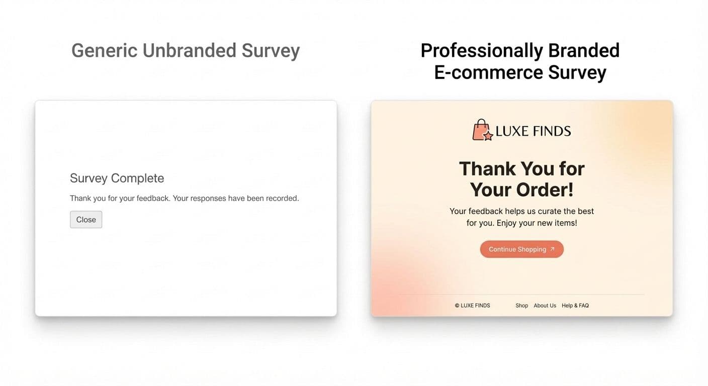
The confirmation screen is the last impression a respondent has of your survey experience. Use it. Redirect them to a relevant page on your website, offer a discount code, link to a content resource, or simply thank them in your brand voice with a personal message from someone on your team. A generic "Your response has been recorded" is a wasted touchpoint.
Some teams use the thank-you page as a lightweight CTA: "Want to help us improve further? Join our research panel." This works well when the survey experience was positive and on-brand.
How to brand your surveys in MindProbe
MindProbe lets you apply your brand colours, logo, fonts and custom domain to any survey in a few clicks. You can set brand defaults at the account level so every new survey starts on-brand, then override individual elements per project when needed. There is no coding required and no premium tier needed to access branding features.
For a full walkthrough of online survey fundamentals, see The Complete Guide to Online Surveys. For brand research strategy, read The Complete Guide to Brand Research.
Common survey branding mistakes
Even teams that understand the value of branding make errors that undermine the effort. These are the ones that come up most often.
Branding the survey but not the invitation
A beautifully branded survey means nothing if the email that links to it looks like spam. The invitation is the first touchpoint, and it sets expectations for everything that follows. Make sure your sender name, subject line, email template and preview text all match your brand. If the email looks off-brand, many respondents will delete it before they ever see the survey.
Forgetting mobile
More than half of survey responses now come from mobile devices (Statista, 2024). If your logo renders at desktop dimensions on a phone screen, or your brand colours make small text hard to read on a bright display, you have a usability problem masquerading as a branding problem. Test every survey on a real phone (not just a desktop preview mode) before you launch.
Over-branding
There is a threshold where branding becomes clutter. Giant hero images, animated logos, full-bleed backgrounds and marketing slogans on every page slow load times and distract respondents from the actual questions. Keep it clean. Your brand should frame the experience, not compete with it for attention. A logo, your colours, a clean font. That is usually enough.
Using different branding for different survey types
Your NPS survey, your product feedback form, your onboarding survey and your annual customer research should all look like they came from the same company. If each has a different visual treatment, respondents lose the sense of a unified research programme. Set account-level brand defaults and enforce them.
Ignoring accessibility
Brand colours that look great on your website might fail contrast checks in a survey context, particularly for respondents with colour vision deficiency or those viewing on older screens. WCAG 2.1 Level AA requires a minimum contrast ratio of 4.5:1 for body text and 3:1 for large text. Check your brand colour combinations against these thresholds. If your primary green on white fails the check, use your dark variant for text and keep the bright version for accents only.
The bottom line
Survey branding is not decoration. It is a direct lever for response rates, data quality and long-term brand trust. The effort to get it right is genuinely minimal compared to the cost of sending out surveys that look like they belong to a different company. Set your brand defaults once, test them on mobile, and let every survey benefit automatically.
If you are building a research programme from scratch, start with the fundamentals. Read The Complete Guide to Online Surveys for the strategic framework, and check the survey branding glossary entry for a concise definition you can share with your team. In addition we also have a library of expert-designed templates.
Start building branded surveys with MindProbe
REFERENCE LINKS
• Dillman et al. (2020) - Tailored Design Method: https://doi.org/10.1002/9781119263685
• Pew Research Center - Survey methodology: https://www.pewresearch.org/methods/
• Statista - Mobile survey statistics: https://www.statista.com/topics/779/mobile-internet/